(adsbygoogle = window.adsbygoogle || []).push({ google_ad_client: "ca-pub-4811569576492328", enable_page_level_ads: true }); Beyond The Technical Analysis Expended: Stock Market Theory Beyond The Technical Analysis Expended: Stock Market Theory
  • Beyond The Technical Analysis Expended
    “Education breeds confidence. Confidence breeds hope. Hope breeds peace.”
    Technical Analysis in called an art to forecast price movements.
    Understanding and having command on these absurd looking lines can make you richest man in the world.
    Welcome to my Technical Analysis Tutorial Blogs
Showing posts with label Stock Market Theory. Show all posts

Harmonic Pattern

HARMONIC PATTERNS

Harmonic price patterns take geometric price patterns to the next level by using Fibonacci numbers to define precise turning points. Unlike other trading methods, Harmonic trading attempts to predict future movements. This is in vast contrast to common methods that are reactionary and not predictive. Let's look at some examples of how harmonic price patterns are used to trade on the market. (Extensions, clusters, channels and more! Discover new ways to put the "golden ratio" to work.
Combine Geometry and Fibonacci Numbers
Harmonic trading combines patterns and math into a trading method that is precise and based on the premise that patterns repeat themselves. At the root of the methodology is the primary ratio, or some derivative of it (0.618 or 1.618). Complementing ratios include: 0.382, 0.50, 1.41, 2.0, 2.24, 2.618, 3.14 and 3.618. The primary ratio is found in almost all natural and environmental structures and events; it is also found in man-made structures. Since the pattern repeats throughout nature and within society, the ratio is also seen in the financial markets, which are affected by the environments and societies in which they trade. (Don't make these common errors when working with Fibonacci numbers - check out
Top Fibonacci Retracement Mistakes To Avoid) By finding patterns of varying lengths and magnitudes, the trader can then apply Fibonacci ratios to the patterns and try to predict future movements. The trading method is largely attributed to Scott Carney, although others have contributed or found patterns and levels that enhance performance.
Issues with Harmonics
Harmonic price patterns are extremely precise, requiring the pattern to show movements of a particular magnitude in order for the unfolding of the pattern to provide an accurate reversal point. A trader may often see a pattern that looks like a harmonic pattern, but the Fibonacci levels will not align in the pattern, thus rendering the pattern unreliable in terms of the Harmonic approach. This can be an advantage, as it requires the trader to be patient and wait for ideal set-ups.

Harmonic patterns can gauge how long current moves will last, but they can also be used to isolate reversal points. The danger occurs when a trader takes a position in the reversal area and the pattern fails. When this happens, the trader can be caught in a trade where the trend rapidly extends against them. Therefore, as with all trading strategies, risk must be controlled.

It is important to note that patterns may exist within other patterns, and it is also possible that non-harmonic patterns may (and likely will) exist within the context of harmonic patterns. These can be used to aid in the effectiveness of the harmonic pattern and enhance entry and exit performance. Several price waves may also exist within a single harmonic wave (for instance a CD wave or AB wave). Prices are constantly gyrating; therefore, it is important to focus on the bigger picture of the time frame being traded. The fractal nature of the markets allows the theory to be applied from the smallest to largest time frames.
To use the method, a trader will benefit from a chart platform that allows the trader to plot multiple Fibonacci retracements to measure each wave.

The Visual Patterns and How to Trade Them 

There is quite an assortment of harmonic patterns, although there are four that seem most popular. These are the Gartley, butterfly, bat and crab patterns.

GARTLEY PATTERN

The Gartley was originally published by H.M. Gartley in his book Profits in the Stock Market and the Fibonacci levels were later added by Scott Carney in his book The Harmonic Trader. 
Figure 1: The Gartley Pattern.
 The bullish pattern is often seen early in a trend, and it is a sign the corrective waves are ending and an upward move will ensue at point D. All patterns may be within the context of a broader trend or range and traders must be aware of that (see Elliott Wave Theory). Point D is a 0.786 correction of the XA wave, and it is a 1.27 or 1.618 extension of the BC wave. The area at D is known as the potential reversal zone (PRZ). This is where long positions could be entered, as some price confirmation of reversal is encouraged. A stop is placed just below the PRZ.
More About  Bullish / Bearish Gartley Pattern.
Bearish Gartley 
The bearish gartley pattern formation is similar to head and shoulders pattern, but as you can see the point C is below the point A, hence it is not head and shoulder pattern. 

Formation and trading strategy of Bearish Gartley pattern:


  1. Point B must retrace 61.8% of AX movement.
  2. Point C must retrace anywhere from 38.2% to 88.6% of BA movement.
  3. Point D must be 138.2% or 161.8% extension of the BC movement.
  4. Point D must retrace 76.8% of AX movement. This is our selling area.


Bullish Gartley 
The bullish pattern is as seen below, its formation is quite similar to inverse head and shoulders pattern, but as you can see below point C is not on the same level as point A.

Formation of Bullish Gartley pattern and trading strategy:

  1. Point B can retrace 61.8% of XA movement.
  2. Point C can retrace anywhere from 38.2% to 88.6% of AB movement.
  3. Point D can be 138.2% or 161.8% extension of the CD move.
  4. Point D can retrace 76.8% of XA movement. Point D is our buying area.
Stop loss in this is always very strict and hence we get very cool risk reward ratio, many times around 1:5 or more. The very important reason for trading this pattern is that it is based on uncertain places where traders are most afraid to take positions, hence giving better meaning for risk.

Butterfly Pattern

Figure 2: The Butterfly Pattern

The butterfly pattern is different than the Gartley in that it focuses on finding reversals at new lows (bullish) or new highs (bearish). D is a new low and a potential reversal point if the Fibonacci figures align with the structure. D would need to be an extension of BC in the magnitude of 1.618 or 2.618. This should align with an extension of XA in the magnitude of a 1.27 or 1.618. Entry is taken near D with price confirmation of the reversal encouraged. Stops are placed slightly below the potential reversal area (bullish). 

Bat Pattern

Figure 3: The Bat Pattern
The bat pattern is similar to Gartley in appearance, but not in measurement. Point B has a smaller retracement of XA of 0.382 or 0.50 (less than 0.618), but the extension of the BC wave into D is at minimum 1.618 and potentially 2.618. Therefore, D will be a 0.886 retracement of the original XA wave. This is the PRZ: when selling has stopped and buying enters the market, enter a long position and take advantage of the bullish pattern. Place a stop just below the PRZ.

Crab Pattern

Figure 4: The Crab Pattern

The crab is considered by Carney to be one of the most precise of the patterns, providing reversals in extremely close proximity to what the Fibonacci numbers indicate. This pattern, similar to the butterfly, looks to capture a high probability reversal at a new (recent) low or high (bullish or bearish respectively). In a bullish pattern, point B will pullback 0.618 or less of XA. The extension of BC into D is quite large, from 2.24 to 3.618. D (the PRZ) is a 1.618 extension of XA. Entries are made near D with a stop-loss order just outside the PRZ.


Fine-Tuning Entries and Stops
 
Each pattern provides a PRZ. This is not an exact level, as two measurements - extension or retracement of XA - creates one level at D and the extension of BC creates another level at D. This actually makes D a zone where reversals are likely. Traders will also notice that BC can have differing extension lengths. Therefore, traders must be aware of how far a BC extension may go. If all projected levels are within close proximity, the trader can enter a position at any area. If the zone is spread out, such as on longer-term charts where the levels may be 50 pips or more apart, it is important to wait to see if the price reaches further extension levels of BC before entering a trade.

Stops can be placed outside the largest potential extension of BC. In the crab pattern, for example, this would be 3.618. If the rate reversed before 3.618 was hit, the stop would be moved to just outside the closed Fibonacci level to the rate low (bullish pattern) or rate high (bearish pattern) in the PRZ.

Figure 5 is an intra-day example of a butterfly pattern from May 3, 2011.

Figure 5. Bearish Butterfly Pattern - EUR/USD, 15 Minute
 The price touches almost exactly the 1.618 extension level of XA at 1.4892 and the extension of BC to 2.618 is very close at 1.4887 (there are two Fibonacci tools used, one for each wave). This creates a very small PRZ, but it may not always be the case. Entry is taken after the rate enters the zone and then begins to retreat. The stop is placed just outside the most significant level that was not reached by the rate, in this case a few pips above the 1.618 XA extension. Targets can be based on support levels within the pattern; therefore, an initial profit target would be just above point B.

 The Bottom Line
 
Harmonic trading is a precise and mathematical way to trade, but it requires patience, practice and a lot of study to master the patterns. Movements that do not align with proper pattern measurements invalidate a pattern and can lead traders astray. The Gartley, butterfly, bat and crab are the better-known patterns that traders can watch for. Entries are made in the potential reversal zone when price confirmation indicates a reversal, and stops are placed outside the nearest significant (for the pattern) Fibonacci level that was not hit by the BC or XA extensions/retracements into the D (PRZ) area.

Read more »

Top Fibonacci Retracement Mistakes To Avoid

Top Fibonacci Retracement Mistakes To Avoid 

Every trader will use Fibonacci retracements at some point in their trading career. Some will use it just some of the time, while others will apply it regularly. But no matter how often you use this tool, what's most important is that you use it correctly each and every time. (For background reading on Fibonacci, see Fibonacci And The Golden Ratio.)
Improperly applying technical analysis methods will lead to disastrous results, such as bad entry points and mounting losses on currency positions. Here we'll examine how not to apply Fibonacci retracements to the foreign exchange markets. Get to know these common mistakes and chances are you'll be able to avoid making them - and suffering the consequences - in your trading.

1. Don't mix Fibonacci reference points.

When fitting Fibonacci retracements to price action, it's always good to keep your reference points consistent. So, if you are referencing the lowest price of a trend through the close of a session or the body of the candle, the best high price should be available within the body of a candle at the top of a trend: candle body to candle body; wick to wick.
Misanalysis and mistakes are created once the reference points are mixed - going from a candle wick to the body of a candle. Let's take a look at an example in the euro/Canadian dollar currency pair. Figure 1 shows consistency. Fibonacci retracements are applied on a wick-to-wick basis, from a high of 1.3777 to the low of 1.3344. This creates a clear-cut resistance level at 1.3511, which is tested and then broken.  

Figure 1: A Fibonacci retracement applied to price action in the euro/Canadian dollar currency pair.
Figure 2, on the other hand, shows inconsistency. Fibonacci retracements are applied from the high close of 1.3742 (35 pips below the wick high). This causes the resistance level to cut through several candles (between February 3 and February 7), which is not a great reference level.

Figure 2: A Fibonacci retracement applied incorrectly.
By keeping it consistent, support and resistance levels will become more apparent to the naked eye, speeding up analysis and leading to quicker trades.  

2. Don't ignore long-term trends.

New traders often try to measure significant moves and pullbacks in the short term - without keeping the bigger picture in mind. This narrow perspective makes short-term trades more than a bit misguided. By keeping tabs on the long-term trend, the trader is able to apply Fibonacci retracements in the correct direction of momentum and set themselves up for great opportunities.

In Figure 3, below, we establish that the long-term trend in the British pound/New Zealand dollar currency pair is upward. We apply Fibonacci to see that our first level of support is at 2.1015, or the 38.2% Fibonacci level from 2.0648 to 2.1235. This is a perfect spot to go long in the currency pair.  

Figure 3: A Fibonacci retracement applied to the British pound/New Zealand dollar currency pair establishes a long-term trend.
 But, if we take a look at the short term, the picture looks much different.

Figure 4: A Fibonacci retracement applied on a short-term time frame can give the trader a false impression.
After a run-up in the currency pair, we can see a potential short opportunity in the five-minute time frame (Figure 4). This is the trap.

By not keeping to the longer term view, the short seller applies Fibonacci from the 2.1215 spike high to the 2.1024 spike low (February 11), leading to a short position at 2.1097, or the 38% Fibonacci level.

This short trade does net the trader a handsome 50-pip profit, but it comes at the expense of the 400-pip advance that follows. The better plan would have been to enter a long position in the GBP/NZD pair at the short-term support of 2.1050.
Keeping in mind the bigger picture will not only help you pick your trade opportunities, but will also prevent the trade from fighting the trend.

3. Don't rely on Fibonacci alone.

Fibonacci can provide reliable trade setups, but not without confirmation.

Applying additional technical tools like MACD or stochastic oscillators will support the trade opportunity and increase the likelihood of a good trade. Without these methods to act as confirmation, a trader will be left with little more than hope of a positive outcome.

Taking a look at Figure 5, we see a retracement off of a medium-term move higher in the euro/Japanese yen currency pair. Beginning on January 10, 2011, the EUR/JPY exchange rate rose to a high of 113.94 over the course of almost two weeks. Applying our Fibonacci retracement sequence, we arrive at a 38.2% retracement level of 111.42 (from the 113.94 top). Following the retracement lower, we notice that the stochastic oscillator is also confirming the momentum lower. 

Figure 5: The stochastic oscillator confirms a trend in the EUR/JPY pair.
Now the opportunity comes alive as the price action tests our Fibonacci retracement level at 111.40 on January 30. Seeing this as an opportunity to go long, we confirm the price point with stochastic - which shows an oversold signal. A trader taking this position would have profited by almost 1.4%, or 160 pips, as the price bounced off the 111.40 and traded as high as 113 over the next couple of days.

4. Don't use Fibonacci over short intervals.

Day trading the foreign exchange market is exciting but there is a lot of volatility.

For this reason, applying Fibonacci retracements over a short time frame is ineffective. The shorter the time frame, the less reliable the retracements levels. Volatility can, and will, skew support and resistance levels, making it very difficult for the trader to really pick and choose what levels can be traded. Not to mention the fact that in the short term, spikes and whipsaws are very common. These dynamics can make it especially difficult to place stops or take profit points as retracements can create narrow and tight confluences. Just check out the Canadian dollar/Japanese yen example below.

Figure 6: Fibonacci is applied to an intraday move in the CAD/JPY pair over a three-minute time frame.
In Figure 6, we attempt to apply Fibonacci to an intraday move in the CAD/JPY exchange rate chart (over a three-minute time frame). Here, volatility is high. This causes longer wicks in the price action, creating the potential for misanalysis of certain support levels. It also doesn't help that our Fibonacci levels are separated by a mere six pips on average - increasing the likelihood of being stopped out.

Remember, as with any other statistical study, the more data that is used, the stronger the analysis. Sticking to longer time frames when applying Fibonacci sequences can improve the reliability of each price level.

The Bottom Line

As with any specialty, it takes time and practice to become better at using Fibonacci retracements in forex trading. Don't allow yourself to become frustrated; the long-term rewards definitely outweigh the costs. Follow the simple rules of applying Fibonacci retracements and learn from these common mistakes to help you analyze profitable opportunities in the currency markets.  
Read more »

Gann Theory - Gann analysis

Gann Theory

 Investment strategy developed by W D Gann, a successful twentieth century Wall Street trader, using continuous detailed analysis of the rate of change of stockmarket prices and applying strict trading rules, especially stop-loss levels.  The Gann analysis is based on Natural Law, geometrical proportions, and the Gann’s law of vibration, where every asset has its own vibration according to its individual energy.

Gann analysis

William Delbert Gann, was the creator of the  very popular Gann analysis, which includes such tools as  the Gann Fan, Gann Trend and Gann Grid. Gann used Natural Law (the usage of reason to analyse human nature and its moral acts) and geometric proportions based on the circle, square and triangle, to forecast prices and to provide a base for his theories. His analyses were based only on the relationship between time and price. 
Another theory  which the general Gann analysis is based on is the Law of Vibration. The principles of  Gann’s Law of Vibration, applied to the capital markets, were first presented to the public in his interview in 1909 to the “Ticker and investment digest”, and may be summarised as follows:

Each stock has its own distinctive path and range of activities based on trade volume, direction and others. All of them  move according to their individual patterns or as defined by Gann “Vibrations”. Gann also compared the stocks to atoms by stating that the first are also a kind of centre of energy which may also be defined mathematically. Another interesting statement from Gann is the opinion that stocks possess powers just as magnets do - they can attract and repel - meaning that sometimes they may be leaders in a market for a moment, and in the next, just stagnate.
 
Together with the above theories, Gann concepts were mostly based on mathematics, and its numbers retrieved from ancient history, like egyptology or even the bible. Some numbers had special meaning in his concepts of price forecasting, the most significant being 16, 25, 36, 49, 64, 121 and 144. According to Gann, these numbers together with geometry and  natural law have provided the proposed tools with a very significant forecasting ability.

Rule of thumb

  • Gann's theoretical approach may seem to be rather enigmatic, however its practical application on financial markets comes down to usage of a number of tools
  • The  most important are described within this section, and it can be quite simple
Gann Line

Gann Line is a simple tool indicating the direction of a current market tendency and its possible points of reversal.
The Gann Line is the most basic tool among the array of forecasting instruments based upon the theory created by W.D. Gann. The method is constituted by a line, drawn at an angle of 45 degrees, either ascending or descending. According to Gann’s theory, the trendline at 45 degrees represents a long-term trendline.


In the case of an ascending line, as long as prices remain above the trendline, the market is considered to be bullish. A fall of a price below that level may indicate a discontinuation of  a rising trend. On the other hand, prices below the descending line signal a significant downward market trend.

Rule of thumb

  • The Gann Line is based on the theory that the long-term trends follow a 45 degree line
  • As long as the prices remain above this line, the market tendency is considered to be bullish
Gann Grid
 
The Gann Grid may appear to be chaotic at first glance, however once properly set, it may provide insight into the development of the situation on the market.

Gan Grid is a variation of the 45 degrees Gann’s Line.

The 45 degree trendline is considered a long term trend, and prices  above that line are considered to be bullish. A situation when the market prices remain under the 45 degree line is considered to be bearish. Instead of having only one 45 degree trendline, the grid compiles a set of 45 degree lines plotted over a price chart. Whenever the price stays above one of the ascending lines, the asset is considered to be in a bullish movement.


On the other hand, whenever the price stays below one of the descending lines, the asset is considered to be in a bearish movement.

Rule of thumb

  • Gann Grids implement the Gann’s theory, where a grid of lines at 45 degrees indicates  possible market patterns.
Gann Fan
 
Gann Fan is based on the theory that the relationship between time and prices follows certain patterns, and the tool is aimed at the separation of bullish from bearish prices.

The Gann Fan is one of the many techniques W.D. Gann developed to study price movements.
For the Gann Fan, it is required for charts to be drawn with equal time and price intervals, so that a price movement for each time interval equals a 45 degree angle. Gann believed that the ideal balance between time and price exists when prices move at a 45 degree angle, relative to the time axis.

Based on Gann theories, the Gann Fan is made up of 9 trendlines, which function as  support and resistance lines. When a price breaks one line, it should move to another line. The most important line in the Gann Fan is the 1x1 trendline (based on the 45 degree Gann line). Depending on the price being above or below this line, it will indicate a bull  or bear market. Besides this major trendline, Gann indicates 8 other minor trendlines, with angles greater/less than 45 degrees (4 greater and 4 less than 45 degrees). These minor trendlines are 1x2, 1x3, 1x4, and 1x8.

Rule of thumb

  • The Gann Fan is generally used to determine trends - general market directions and potential support and resistance lines.
Read more »

Uncommon Theory-Mathod

Chaos Theory'

A mathematical concept that explains that it is possible to get random results from normal equations. The main precept behind this theory is the underlying notion of small occurrences significantly affecting the outcomes of seemingly unrelated events. Chaos theory has been applied to many different things, from predicting weather patterns to the stock market. Simply put, chaos theory is an attempt to see and understand the underlying order of complex systems that may appear to be without order at first glance. 
Related to financial markets, proponents of chaos theory believe that price is the very last thing to change for a stock, bond, or some other security. Price changes can be determined through stringent mathematical equations predicting the following factors:
1) A trader's own personal motives, needs, desires, hopes, fears and beliefs are complex and nonlinear.
2) Volume changes
3) Acceleration of the changes
4) Momentum behind the changes
Chaos theory is highly controversial and extremely complicated.

 The science of chaos has given us a couple of principles that are applicable in the financial markets:


  • You, your nails, your market orders follow the path of least of resistance
  • The path of least resistance is determined by the always underlying (and typically unseen) structure

Let us say you have a river running down the mountain. The behavioural decisions that the river makes does not depend on the mind of the river but the riverbed itself. So if you have a riverbed that is shallow and narrow that river is going to go down in rapids. If you have a riverbed that is wide and deep you are going to have a calm pond. So if you want to change the flow of that river you can get buckets and start a bucket brigade or go up to the start of the river where the force of the water is still so slow that it only takes replacing a few rocks to change the direction and it will change everything. Picture
Then there is this thing called the butterfly effect.

That theory simply says that somewhere in South America there is this little Monarch butterfly that flaps its wings as it is flying around looking for some pollen and it sees a flower over here and as he is going there he sees a better flower somewhere else and decides to change its path. As he changes his mind, that is a fractal. The change in his path sets up a little air current and that air current sets up another air current that sets up another air current that keeps the high level winds off of the Antarctica which causes a hurricane like the El Niño, which causes a drought next year in the bean belt and we are going to have beans in the teens because of this little Monarch butterfly that changed his mind.


So how do we trade fractals and what do they look like on a chart? 

  • A fractal is a trend change
  • A swing top or a swing bottom is a fractal
  • The end of every Elliot wave is a fractal
  • A fractal requires a minimum of five bars
  • Fractals show the path of least resistance
  • A fractal trading system works in all time frames

In the example below you have the market going up as evident by the highs. All we care about here is the highs and not the open, high, low and close. Any time you have a sequence of five bars where you have one bar that has two preceding lower highs followed by two preceding lower highs you have a fractal.

If you have a fractal whose middle finger is parallel to the top, the second one does not count. They both count as one (as in the case below where you have two candles whose highs are identical). In the chart below you see how the market started trading up, changed its mind and now it is going down. Coming up, the left leg must be longer than the right leg for a buy fractal to be valid.
 
After the buy fractal triggers a long position, the sell fractal is negated. For a new sell fractal to set up you will need to see a high, followed by three lower lows and two higher lows, none of which can trade through the high of the first bar. When you have a fractal in one direction which is followed by a fractal in the other direction you have an Elliot wave of one degree or another.
 

So this market started trading up the page, changed its mind (like the Monarch butterfly) and traded down the page. It then changed its mind again and traded through the previous high, just following the path of least resistance. By religiously taking trades only when fractals break, we effectively rule out fighting the market. The challenge, of course, is to avoid double tops/bottoms and not get caught long on up thrusts and short on springs.

 You always hear that what goes up must come down but one of the things that chaos teaches us is that Newton's laws of motions do not apply universally. They apply to man-made things. Market fundamentalists have a fundamentally flawed conception of how financial markets operate. They believe that financial markets tend toward equilibrium.

Equilibrium theory in economics is based on a false analogy with physics. Physical objects move the way they move irrespective of what anybody thinks but financial markets attempt to predict a future that is contingent on the decisions people make in the present. Instead of just passively reflecting reality, financial markets are actively creating the reality that they, in turn, reflect. There is a two-way connection between present decisions and future events, which George Soros calls reflexivity.

So having said all that; when do I want to be in a trade?

  • when I can make the most amount of money in the least amount of time
  • when volatility explodes and ranges expand
  • when odds increase of a directional move
  • when risk:reward is favourable
You do not want to put your hard earned cash at risk in a market that just moves about randomly but get onboard a market that has clearly signalled that it is done consolidating and now ready to move.
Look for inside candles (range contraction) and then a break uptown or downtown (range expansion). As a rule of thumb, the longer the timeframe the rarer the trade but the more powerful the signal will be.

Also the more inside candles within inside candles the more powerful the signal will be. The reason is that the more time traders have to build positions the bigger the effect as these positions are unwound.

Below is a great example of how just by looking at candles you can pinpoint the most opportune time to get in.
Only imagine how many traders looking at overbought indicators either sold out too early or faded the move.
 

Fractals 

 Many people believe that the markets are random. In fact, one of the most prominent investing books out there is "A Random Walk Down Wall Street" (1973) by Burton G. Malkiel, who argues that throwing darts at a dartboard is likely to yield results similar to those achieved by a fund manager (and Malkiel does have many valid points). However, many others argue that although prices may appear to be random, they do in fact follow a pattern in the form of trends. One of the most basic ways in which traders can determine such trends is through the use of fractals. Fractals essentially break down larger trends into extremely simple and predictable reversal patterns. This article will explain what fractals are and how you might apply them to your trading to enhance your profits.

What Are Fractals? When many people think of fractals in the mathematical sense, they think of chaos theory and abstract mathematics. While these concepts do apply to the market (it being a nonlinear, dynamic system), most traders refer to fractals in a more literal sense. That is, as recurring patterns that can predict reversals among larger, more chaotic price movements. These basic fractals are composed of five or more bars. The rules for identifying fractals are as follows:

  • A bearish turning point occurs when there is a pattern with the highest high in the middle and two lower highs on each side.
  • A bullish turning point occurs when there is a pattern with the lowest low in the middle and two higher lows on each side.
The fractals shown in Figure 1 are two examples of perfect patterns. Note that many other less perfect patterns can occur, but the basic pattern should remain intact for the fractal to be valid.
Figure 1
The obvious drawback here is that fractals are lagging indicators - that is, a fractal can't be drawn until we are two days into the reversal. While this may be true, most significant reversals last many more bars, so most of the trend will remain intact (as we will see in the example below). Applying Fractals to Trading Like many trading indicators, fractals are best used in conjunction with other indicators or forms of analysis. Perhaps the most common confirmation indicator used with fractals is the "Alligator indicator", a tool that is created by using moving averages that factor in the use of fractal geometry. The standard rule states that all buy rules are only valid if below the "alligator's teeth" (the center average), and all sell rules are only valid if above the alligator's teeth.
Figure 2 is an example of such a setup:
Figure 2
The obvious drawback here is that fractals are lagging indicators - that is, a fractal can't be drawn until we are two days into the reversal. While this may be true, most significant reversals last many more bars, so most of the trend will remain intact (as we will see in the example below). Applying Fractals to Trading Like many trading indicators, fractals are best used in conjunction with other indicators or forms of analysis. Perhaps the most common confirmation indicator used with fractals is the "Alligator indicator", a tool that is created by using moving averages that factor in the use of fractal geometry. The standard rule states that all buy rules are only valid if below the "alligator's teeth" (the center average), and all sell rules are only valid if above the alligator's teeth.
Figure 2 is an example of such a setup: 
Figure 3

Here is a basic rule setup that is used when using a chart with a four-hour time frame:

  • Initiate a position when the price has hit the farthest Fibonacci band, but only after a daily (D1) fractal takes place.
  • Exit a position after a daily (D1) fractal reversal takes place.
Notice how the fractals pinpoint meaningful tops and bottoms? This helps to take the guesswork out of deciding at which Fibonacci level to trade - all we have to do is check to see if the daily fractal occurred. We should also note that the trend strength began increasing at the sell fractal, and topped at the buy fractal. Although we lose some pips with the confirmation, it saves us from losing out on mere market noise - 139 pips certainly isn't bad for three days!

Things to Consider Here are a few things to remember when using fractals:

  • They are lagging indicators. They are best used as confirmation indicators to help confirm that a reversal did take place. Real-time tops and bottoms can be surmised with other techniques.
  • The longer the time period (i.e. the number of bars required for a fractal), the more reliable the reversal. However, you should also remember that the longer the time period, the lower the number of signals generated.
  • It is best to plot fractals in multiple time frames and use them in conjunction with one another. For example, only trade short-term fractals in the direction of the long-term ones. Along these same lines, long-term fractals are more reliable than short-term fractals.
  • Always use fractals in conjunction with other indicators or systems. They work best as decision support tools, not as indicators on their own.
Conclusion As you can see, fractals can be extremely powerful tools when used in conjunction with other indicators and techniques, especially when used to confirm reversals. The most common usage is with the "Alligator indicator"; however, there are other uses too, as we've seen here. Overall, fractals make excellent decision support tools for any trading method. Resources These are the two main charting packages that contain fractals:
  • MetaTrader 
  • TradeStation for equities (via plug-in)
If you want to know more about chaos theory and its applications in the marketplace, an excellent book on the topic is "Profiting From Chaos" (1994) by Tonis Vaga.


Chaos Theory Market Fractals - By-Nadeem Walayat's.


Are Elliott Wave's Chaos Theory?
Whilst there are many elements to chaos theory, my focus that grew out of studying the Julia and Mandelbrot sets was fractals. In that clearly the stock and other market price action resembles fractal structures as the same structure appears to repeat on ALL time frames. At the time it seemed that Elliott Wave and Chaos theory were very similar of not the same thing, in that Elliott Waves are the fractals for market price action that appear to on ALL time frames as discovered in the 1930's by RN Elliott which was decades before Mandelbrot appeared on the scene.
However on spending many, many years going down this path I concluded that Elliott Waves and Chaos Theory are NOT the same. Elliott Wave theory is something ELSE, yes, it resembles Chaos Theory i.e. Fractals, but it is not Chaos theory Fractals.
Again they look very similar but in a way Chaos Theory is Elliott Waves without having to know the WAVES! That may sound confusing but that is actually how it is. In Chaos Theory all one would know is What is Impulse and What is Corrective, and that is it! None of the 5th of the 5th of the 5th or ABC or the rest matter, just Impulse or Corrective. Which is probably what many experienced elliotticians eventually conclude without ever having ventured into chaos theory that at the end of the day the only thing that matters is Impulse or Corrective and not What Elliott Wave implies i.e. that Stocks 1987 peak was the final 5th of the 5th of the 5th and then so were each of the subsequent bull market peaks right into the present days bull market.

Fractal Theory
In a way Chaos Theory should really have been called Fractal Theory, because rather than chaos i.e. randomness it actually implies order and structure, and that structure is found in fractals.
The point about Fractals is that they give you a window into probabilities for price action on ALL market levels, i.e. hourly, daily, weekly, monthly, even yearly. I.e. fractals are akin to flexible pattern recognition, simple patterns that repeat and result in high probabilities given certain conditions which in themselves are flexible, so it unlike traditional chart patterns such as Head and Shoulders, the interpretation of market fractals is dependant upon changing conditions, such as trend, cycles, and volume.

What are Market Fractals ?
Simply put Market fractals are trend changes. A trend change is either a reversal of the Impulse trend or an end of the Corrective trend on ANY time frame.

Fractal Patterns
Fractal patterns are not complicated, you already know the more common ones, such as spike, double and triple tops and bottoms that occur on ALL time frames, what you don't know or have not studied are the conditions that increase their probabilities for particular markets at particular points in time, such as volume, preceding trend, and momentum oscillators (I use the MACD) once you factor these into the equation amongst your TRIGGER (Fractal) increases in probability exponentially, as it reduces the instances of its occurrence. Still it does requires HARD WORK for the market one trades to identify the current TRIGGERS (Fractals), especially when one starts going down the path of fractals of fractals i.e. in this example, a double top plus double top fractal. 
Trading Fractals
It all boils down to practice, knowing current fractal patterns and having them engrained in your mind, and then you WAIT for the FRACTAL TRIGGERS, and REACT in real time, just as as you trade traditional price patterns such as double and triple tops as identified in real time. Fractal triggers are not limited to Bar charts, as you can use other types of charts, my preference is for swing charts as illustrated in "How to Trade Commodities" by WD Gann (not to confuse with the rest of his work which in my opinion is a red herring).
Once you understand that Chaos Theory comprises fractals that give a high probability of an outcome given x, y,z condition then one starts to see fractals EVERYWHERE, for fractals ARE Nature. It is how our universe is constructed on every level, we are living in an unfolding fractal universe, nothing is fixed, everything is in motion, if you understand this then you will now know more truth than anything you will find in any ancient superstition.
The bottom line is this, that there is no black or white, no holy grail, everything has its basis in how we interpret the world around us is be it markets or the wider environment, fractals appear to offer the best window into a better interpretation of the world in our time, until the next innovation comes along.
Read more »

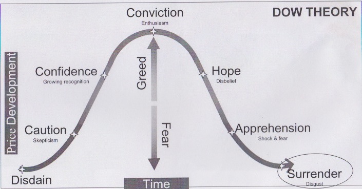
Dow Theory

Dow Theory

The ideas of Charles Dow, the first editor of the Wall Street Journal, form the basis of technical analysis today.

Dow created the Industrial Average, of top blue chip stocks, and a second average of top railroad stocks (now the Transport Average). He believed that the behavior of the averages reflected the hopes and fears of the entire market. The behavior patterns that he observed apply to markets throughout the world.

Dow Theory

Three Movements
Markets fluctuate in more than one time frame at the same time:
Nothing is more certain than that the market has three well defined movements which fit into each other.
  • The first is the daily variation due to local causes and the balance of buying and selling at that particular time (Ripple).
  • The secondary movement covers a period ranging from days to weeks, averaging probably between six to eight weeks (Wave).
  • The third move is the great swing covering anything from months to years, averaging between 6 to 48 months. (Tide).
  • Bull markets are broad upward movements of the market that may last several years, interrupted by secondary reactions. Bear markets are long declines interrupted by secondary rallies. These movements are referred to as the primary trend.
  • Secondary movements normally retrace from one third to two thirds of the primary trend since the previous secondary movement.
  • Daily fluctuations are important for short-term trading, but are unimportant in analysis of broad market movements.
     
Various cycles have subsequently been identified within these broad categories.

Dow Theory

Primary Movements have Three Phases
Look out for these general conditions in the market:
Bull markets
  • Bull markets commence with reviving confidence as business conditions improve.
  • Prices rise as the market responds to improved earnings
  • Rampant speculation dominates the market and price advances are based on hopes and expectations rather than actual results.
Bear markets
  • Bear markets start with abandonment of the hopes and expectations that sustained inflated prices.
  • Prices decline in response to disappointing earnings.
  • Distress selling follows as speculators attempt to close out their positions and securities are sold without regard to their true value.
Ranging Markets
  • A secondary reaction may take the form of a ‘line’ which may endure for several weeks.
  • Price fluctuates within a narrow range of about five per cent.
Breakouts from a range can occur in either direction.
  • Advances above the upper limit of the line signal accumulation and higher prices;
  • Declines below the lower limit indicate distribution and lower prices;
  • Volume is used to confirm price breakouts.


Dow Theory

Trends
Bull Trends
A bull trend is identified by a series of rallies where each rally exceeds the highest point of the previous rally. The decline, between rallies, ends above the lowest point of the previous decline.

Successive higher highs and higher lows.

The start of an up trend is signaled when price makes a higher low (trough), followed by a rally above the previous high (peak):
Start = higher Low + break above previous High.
The end is signaled by a lower high (peak), followed by a decline below the previous low (trough):
End = lower High + break below previous Low.

What if the series of higher Highs and higher Lows is first broken by a lower Low? There are two possible interpretations - see Large Corrections.

Bear Trends

Each successive rally fails to penetrate the high point of the previous rally. Each decline terminates at a lower point than the preceding decline.
Successive lower highs and lower lows.


A bear trend starts at the end of a bull trend: when a rally ends with a lower peak and then retreats below the previous low. The end of a bear trend is identical to the start of a bull trend.

What if the series of lower Highs and lower Lows is first broken by a higher High? This is a gray area - see Large Corrections.

Dow Theory

Large Corrections
A large correction occurs when price falls below the previous low (during a bull trend) or where price rises above the previous high (in a bear trend).


Some purists argue that a trend ends if the sequence of higher highs and higher lows is broken. Others argue that a bear trend has not started until there is a lower High and Low nor has a bull trend started until there is a higher Low and High.

For practical purposes: Only accept large corrections as trend changes in the primary trend:


  • A bull trend starts when price rallies above the previous high,
     
  • A bull trend ends when price declines below the previous low,
     
  • A bear trend starts at the end of a bull trend (and vice versa). 
Read more »
 
SORRY ADBLOCKER DETECTED
It looks like you're using an ad blocker. That's okay. Who doesn't?
But without advertising-income, we can't keep making this site awesome.
Please disable your ad blocker and then reload the page to continue enjoying our site.
Reload Page
Beyond The Technical Analysis - Contact